
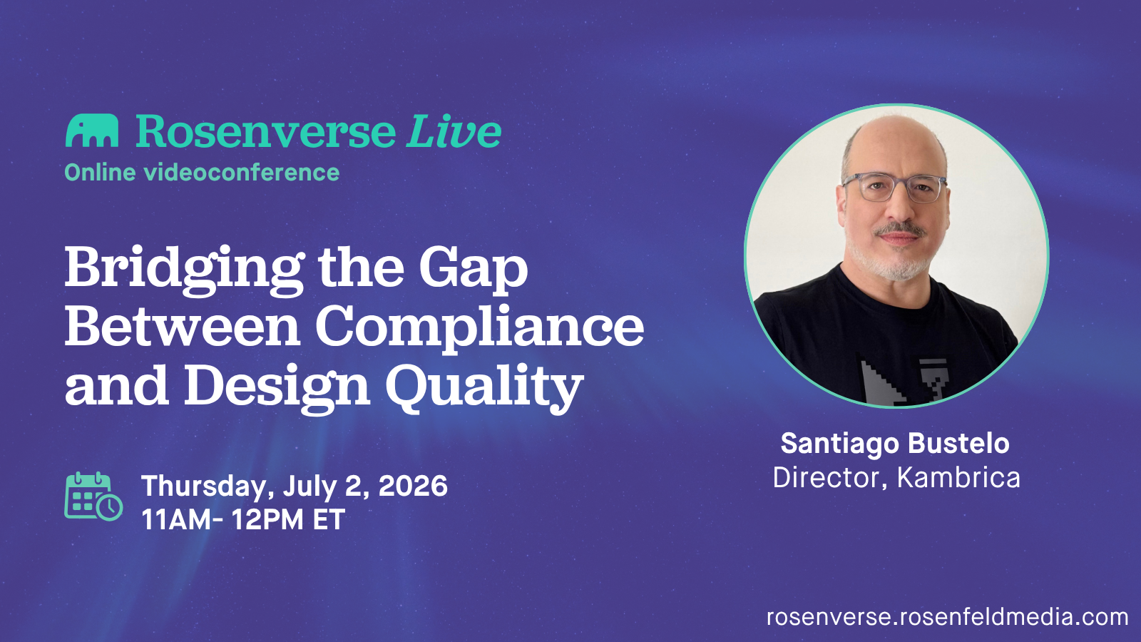
Log in or create a free Rosenverse account to watch this video.
Log in Create free account100s of community videos are available to free members. Conference talks are generally available to Gold members.
Bridging the Gap Between Compliance and Design Quality
This video is featured in the UX Watch Party playlist.

Summary
Many designers experience accessibility as a compliance exercise disconnected from design practice. That's a design problem. After more than 20 years working in accessibility—including early accessibility projects, advocacy, education, and legislation efforts in Argentina—Santiago Bustelo believes that the missing piece is a better bridge between compliance and design practice. In this session, he shares insights, experiments, and lessons from IPAX, an ongoing research initiative exploring the gap between accessibility compliance and accessibility adoption. The session examines why accessibility is often perceived as bureaucratic by design teams, why pair-based validation does not scale well to modern Design Systems, and whether accessibility could become easier to adopt if it also helps designers produce better design outcomes.
Key Insights
-
•
WCAG color contrast guidelines are outdated and sometimes promote poor design choices, like white on black causing visual strain for people with astigmatism.
-
•
Traditional color theory, based on a 200-year-old color wheel, is often at odds with modern accessibility needs and design quality.
-
•
Modern color models like Oklch and contrast scoring from APCA provide more precise assessments of accessible and ergonomic color combinations.
-
•
Santiago’s tool assigns scores from 1 to 5 to color combinations, balancing legal compliance with design quality to guide better choices.
-
•
Only a very limited set of colors work well against both black and white backgrounds, necessitating split color systems for accessibility.
-
•
Client resistance to changing brand color palettes for accessibility often stems from political and cultural attachment rather than technical limitations.
-
•
Presenting accessibility as enhancing brand usability for people over 40 or with common vision conditions can ease client pushback.
-
•
Responsive color systems that adapt colors across light, dark, and high-contrast modes can better serve diverse user needs.
-
•
Building accessible color systems is challenging but feasible if tools reduce the complexity and perceived risk of color adjustments.
-
•
Sustainable development of accessibility tools may require nonprofit structures and open-source licenses to attract funding and wider adoption.
Notable Quotes
"Every mistake you see is their fault. Every mistake's an opportunity, though."
"WCAG says the more contrast, the merrier, but bright white on black can actually cause ghost images for astigmatism."
"There are only two perfect neutral grays that work accessible both against black and white."
"WCAG says it depends, but doesn’t really help you decide what large text or bold means in practice."
"We can have many accents, each split into two shades for light and dark backgrounds to keep accessibility without breaking brand."
"If clients say they don’t care about accessibility, it’s a political problem, not a technical one."
"The system I’m building helps show clients that almost imperceptible color adjustments can make their brand accessible."
"Accessibility is often misunderstood as for a very small population, but most adults have some vision issues."
"Sustaining this kind of work isn’t profitable, but it’s valuable for the community."
"Forming a nonprofit could unlock funding to continue and grow this accessibility tool."
Or choose a question:















More Videos

"We end up with this junk drawer phenomenon with spaghetti-fication of different insights being passed around with no clarity."
Jon White Erin MayUnsticking Research for Better Information Flow
March 11, 2026

"Designers felt like hamsters in a hamster wheel, always reacting, never exploring."
Maria SkaadenContinuous Design: One eye on the horizon and the other on the next wave
November 8, 2018

"The best way to build a fully accessible foundation is to involve the voices of people with disabilities at every step."
Sam ProulxPrototype Reviews, People With Disabilities, and You
December 8, 2021

"There aren’t enough lean UX experts to collaborate with every team, so we create a lean UX Center of Excellence for each value stream."
Jack MoffettSAFe or Sorry?
May 29, 2019

"End your day by writing the to-do list for tomorrow; it’s easy to get distracted when you’re not in a full-time gig."
Greg PetroffExit Interview #1: Greg Petroff: From Silicon Valley Executive to Sonoma County Possibilitarian
September 24, 2025

"Propose new IC roles like a design problem: identify the need, gather research, and try it as an experiment with retrospectives."
Catt Small Micah Bennett Brian Carr Jessica HarlleeWhat's Next for ICs: Exploring Staff and Principal Designer Roles
February 22, 2024

"AI clustering gives a first stab at themes, but you have to move things around yourself."
Shipra KayanMake your research synthesis speedy and more collaborative using a canvas
January 24, 2025

"It’s a love-hate relationship with AI because it can make us more efficient but also devalue our work."
Llewyn PaineDay 1 Using AI in UX with Impact
June 10, 2025

"Digital governance is about who’s supposed to make the decision, not what the decision is."
Lisa WelchmanCleaning Up Our Mess: Digital Governance for Designers
June 14, 2018
Latest Books All books









Dig deeper with the Rosenbot
Why do current capitalist incentives make systemic and community-focused tech solutions difficult to implement?
How can designers protect themselves when challenging toxic organizational cultures?
How can individuals develop personal constraints after leaving full-time employment to maintain productivity?