Log in or create a free Rosenverse account to watch this video.
Log in Create free account100s of community videos are available to free members. Conference talks are generally available to Gold members.
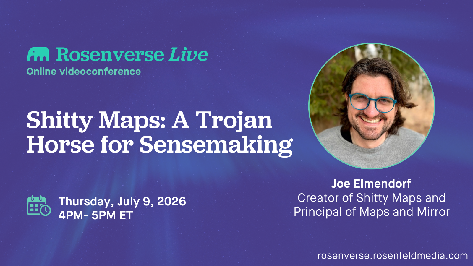
Shitty Maps: A Trojan Horse for Sensemaking
This video is featured in the Learning playlist and 1 more.

Summary
You’ve made shitty-looking maps before. The rough sketch on a napkin while you were figuring out what you actually thought. The boxes-and-arrows scrawl on a whiteboard that helped the room land somewhere. The marginal doodle that did more work than the deck it sat next to. You probably hid them, or threw them away, or recreated them somewhere fancier or “more acceptable” before showing anyone. This session is about not doing that anymore. Polish is a trap. A finished-looking map either gets waved through—it looks done, so it must be right–or the room balks because they weren’t part of figuring it out. Either way, your map is treated as something fixed, and the thinking stops. The rough version doesn’t have that problem. It stays in motion. It invites the room in. And it’s faster than the “real” tools, which only feel fast because they look legitimate while you’re using them. We’ll dig into why looking shitty works, then practice making rough maps together, and the skill behind the practice that makes the whole thing come together.
Key Insights
-
•
Rough, low-fidelity 's****y maps' reduce social risk and invite collaborative iteration rather than confrontation.
-
•
Visual representations persist in conversation, help point to relationships, and map non-linear concepts better than spoken language.
-
•
Power dynamics and inadequate communication mediums often inhibit people from sharing valuable perspectives in meetings.
-
•
Practicing real-time visual thinking with simple tools like note cards builds muscle memory that helps break conversational stalemates.
-
•
'S****y maps' serve as Trojan horses that sneak clarity into conversations without requiring permission or pretense.
-
•
The posture of presenting rough maps as drafts with invitation to correction reduces ego and resistance in group settings.
-
•
High-fidelity polished designs can shut down discussion by implying settled ideas, whereas rough sketches encourage exploration.
-
•
Visual sense-making is a powerful tool for sense-making, trust-building, and aligning stakeholders beyond verbal explanations.
-
•
AI-generated visualizations can augment conversation but often lack the human vulnerability and fluidity of hand-drawn sketches.
-
•
Breaking down complex problems into smaller chunks visually helps transform overwhelming issues into manageable tasks.
Notable Quotes
"Everything that I make looks s****y. How can I turn this into a benefit?"
"The map on the note card wasn’t calling anyone out. It was providing this shared point of reference."
"If something looks rough, people don’t treat it like a declaration. They treat it like a draft."
"Talking is linear, but systems are non-linear. Visual maps show those relationships that words can’t."
"I didn’t magically have crystal-clear thoughts. I changed the conditions just enough."
"S****y maps are a Trojan horse for sense-making because they’re disarming and inviting."
"The willingness to say, ‘I’m not sure this is right, but is this what we’re talking about?’ That is a s****y map."
"Visual sketching shows human vulnerability in a way that AI cannot."
"High-fidelity maps often squash discussion. Rough maps invite it."
"That pen on paper helps your brain think through ideas faster."
Or choose a question:















More Videos

"We turned all of these files in boxes into an Excel file, and then into a shared Google Doc accessible to multiple people."
Emily Danielson“I mean, I can lift a shovel”: Design Skills in Disaster Response
June 9, 2022

"Everyone wants to have an impact on the decisions being made no matter what the role is called."
Jess GrecoClaiming your power: Practical tools for amplifying your unique voice
March 13, 2025

"Sales objections are not customer insights; they serve different purposes and must be treated separately."
Tatyana MamutOpening Keynote: Breaking Conway's Law--or How to Work Differently and Not Ship Your Org Chart
June 3, 2019

"Design is always going to be subjective, so you have to figure out what quality looks like in your organization."
Peter MerholzCustomer-Centered Design Organizations
June 8, 2017

"We're just getting started — there’s an opportunity for all of us to continue to participate and build this community."
Kristin SkinnerTheme 1 Intro
September 29, 2021

"Designers have obligations not just to users but also to society and our own profession."
Cennydd Bowles Dan Rosenberg Lisa WelchmanDay 1 Panel
June 4, 2024

"Almost half of UX teams reported budgets are unchanged despite increased demand for UX."
Dana Bishop2022: The Year UX Demonstrates its Business Impact
March 11, 2022

"They paid a vendor $800 million and launched a single form online, which is no longer in use."
Dan WillisFilling the Void
November 7, 2018

"We must create spaces that allow nature to thrive within our cities."
Lena ShenkarenkoCollaborative Wireframing for Creating Team Alignment and Shipping Better Products
October 21, 2020